In the first picture the quality is lacking an awful lot and
the proffessional look about it is almost none existant. The downsides to this
piece of work would be firstly the dull and plan look to the text on it. This
is a bad feature because having a boring font will not attract an audience to
therefore would hardly be read by a lot of people. Another bad feature about
this would be the effect on the bottom picture. This effect is completely
un-needed and would not be usually seen on a newsletter.
 Some features that actually work on this would be the colour
scheme. The reason why this is good is because these colours are associated
with the school, so therefore there is a reason for them being there. Another
feature would be the school logo in the top right hand corner. This is an
expected feature on newsletters because the logo usually represents the school
and seeing it the audience associates it with the school. Another feature would be some of the phrases
on the piece. The reason why I say this is because most newsletter will want to
display some content without giving too much away and I believe that having
open ended sentances such as “new block builds futures” and “read all this
inside..” does this efficiently for a school newsletter.
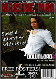
In the picture below some features that you can tell are
suited for a magazine would be the issue number, barcode, website and price.
These would not be needed on a school newsletter but In this certain media they
would not be proffessional if they werent on there. Aswell as these I have also
added another couple of features that I expected to see on the front of a media
piece such as this. These would be the “Free Posters” part to try and persuade
the audience to buy the magazine and also the “special interview with fergs”
part. This would hopefully attract people who would want to find out more about
this interview so by displaying that it would be featured inside, it would
hopefully attract a certain audience to buy it. Another part of this magainze
would be putting the ‘Download’ logo on the front. This would make people who
are familiar with the festival, want to know what the magazine had to say about
it.
A feature about the picture below that I would point out that
could be done better on a more proffessional product, would be the font. The
reason why I have point this out would be because the font doesn’t suit the
title as much as it could. A way to improve this would be to make the font in a
simlar colour or have it in the same font as the title. This would keep a sutiable
house style throughout the product. Although different fonts would be good to
have I feel that the font used isnt as suitable for the style of magazine it
is.

No comments:
Post a Comment